Whip Up

Project Overview
Context:
Our mission was to design a user-friendly and efficient application which would let users generate recipes from food items already available at home, without having to but anything else.
Challenges faced:
-
Decision on what features would be basic in this app, and what would be counted as advanced.
-
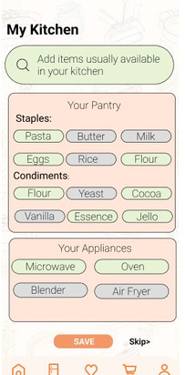
For items that a user would usually have in his pantry, but would not think of adding, we needed a simple interface.
-
The idea of letting the users do the least effort and making everything intuitive was the biggest challenge in creating a app with so many food items to choose from.
My Contribution:
-
Research, prototype and design the page called 'My Kitchen' page (landing page).
-
Went through many iterations of how to make it easy for users to do a one time selection of their 'always available' pantry items.
-
Performed user feedback on prototype to understand what style is the most intuitive to the users for a one time selection.
Team:
-
4 Members ; 2 UX designers ; 1 UX writer ; 1 UX Researcher
Stages of tasks completed:
1. Product Pitch
2. Persona Creation
3. Paper Prototype
4. User Feedback
5. Wireframes
6. User Interviews
7. Qualitative Study
8. Final Clickable Prototype.
PRODUCT PITCH:
After brainstorming ideas from everyone in the team, we decided to create an app which would be useful for students like us. Since what to cook is the most common question we ask in all our households, it seemed like a feasible starting point. With limited income, we all had limited items in our pantries and never an idea what can be done with those. As this would also promote sustainability and reduce wastage (by letting users create a recipe with items that maybe going bad), we found this idea a wholesome first step towards our new app.
user persona creation
User personas created after analysis through following mediums:
-
Survey amongst fellow classmates to understand if they would find this app useful, and the major features they would expect from this app.
-
Research on current websites in similar category and understanding their user demographics
-
Research on which category of people have a major issues of limited pantry options alongside limited time.
WIREFRAMES


FINAL PROTOYPE
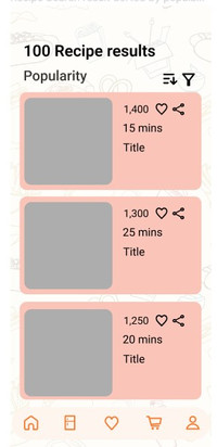
Once our wireframes were ready, the most exciting part was putting out ideas into real design and these are the final clickable design pages our team built. It was much more difficult than expected to create scroll navigations, placement for food items and time needed on same page, and even the global navigation failed us at times. We did a lot of small add-ons to the original ideas keeping in mind different use cases from the feedback we received. We had many other future ambitions for this project, and hope to use them someday.

KEY TAKEAWAYS:
LEARNINGS:
-
Spending time on user research is more important than jumping directly into designing.
-
User feedback on paper prototypes is a good idea.
-
Focus on reducing the efforts needed by users to perform any task is of utmost importance.
-
Competitor analysis of similar apps helps get an idea on what features to add at the beginning of project.
-
Make achievable targets and divide the work clearly among the team.
-
Spend more time on user feedback in initial stages of design itself.
-
Not use my assumptions on what design is the most intuitive and take opinions from users.
It took us 40 days to reach a final stage of wireframes because of the never-ending ideas and discussions. This was our proposed design for all the pages of the app, out of which I worked on the 'My Kitchen' page. It was a challenge to make it easy to understand and navigate through, alongside making it obvious that the page is a one time thing.
