
refugee artisans initiative
Helping an awesome non-profit revamp and redesign their website- using user research, wireframing, interviews and creating final Figma prototype
ABOUT THE
CLIENT
RAI (Refugee Artisans Initiative) is a non-profit helping immigrant women create their own artisanal business to have a sustainable income. They had a Shopify-created website which was text-heavy and needed to get a modernized look.
CHALLENGES
SOLUTIONS
-
Restricted with availability of photos that can be used on website, only a few artisan pictures were available.
-
They had 2 shop pages, one of which redirected to Etsy, and the other one to their own website.
-
Understanding how this unique situation should be handled on their website was a challenge.
-
Did not have visibility to their current audience and had to work with the people and ideas of the staff and our team itself.
-
We used the same pictures in landscape design in the first fold of website, ensuring the artisans have a profound space.
-
We created 2 separate tabs in the shopping navigation, for Etsy buyers and website buyers.
-
Ensured that users were clearly informed about the redirection to another website.
-
Did card sorting with other UXers, and interviewed people of the target age group who donate to non-profits frequently, to understand the thought process.
TOOLS:
Google Studio
Figma
Figjam
TEAM OF 3:
Project Manager
Designer
Researcher
MY ROLE:
Designer
Researcher
TIMELINES:
Overall: 8 Weeks
Research: 5 Weeks
Design & Testing:
3 Weeks
DESIGN PROCESS
User Persona Identification
Competitor Analysis
Card
Sorting
Wireframing
Designing
USER PERSONA
Research on the demographics and traits of people who frequently donate to non-profits, alongside research on people that could be potential buyers. Looked at the data of their current organizational partners to create a generic persona of a partner.
COMPETITOR ANALYSIS
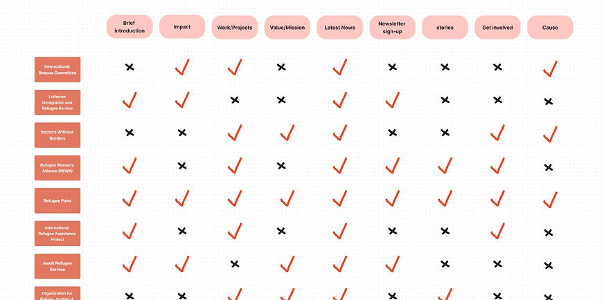
We researched a lot of non-profit websites to understand their website designs. We tried to understand what parts are highlighted in the homepage, what sections are common, and also tried to find patterns to decide our homepage navigation and design. Here is the comparison chart representing what sections each competitor website contains:

And here is the detailed comparative chart of other websites:

CARD SORTING
To make sure that the site’s information architecture is aligned with user expectations, we did 10 remote card sorting sessions.We brainstormed and divided the site into its main components, which later became supersets for navigation bar titles. Testers had to look at the current website links, decide which ones can be clubbed or moved to reduce redundancies on the site. Outcomes were decided on the maximum votes.

LO-FI WIREFRAMES
FINAL PROTOTYPE
KEY TAKEAWAYS
-
For mission driven organizations, the website needs to reflect their story as the highlight
-
When there is lesser scope for user research, competitor analysis needs to be done thoroughly, as you can get a lot of ideas from there.
-
Client feedback at the Lo-Fi stage is important before delving into full fledged design


